


A website is the foundation of any climbing gym’s marketing strategy. No matter what methods you are using to attract new customers, such as advertising in the local newspaper, offering introductory offers on deal-of-the-day websites, or running a member referral program, you will be directing customers to your website for more information about your facility.
Your website serves as an online brochure, storefront and brand ambassador. Yet many businesses are not maximizing the effectiveness of this marketing tool. Here are the top six most common ways climbing gym websites are falling short and advice on how to fix it.
1. SEO Struggles
If you have a website and no one can find it, does it really exist? A significant amount of your traffic will be the result of consumers heading to their favorite search engine to look up your facility by name or by searching for a climbing facility in their town.
If your website does not appear within the top ten search results, it’s highly unlikely that users will find their way to your website, and ultimately through your doors.
SEO (search engine optimization) is the technical term for making sure that your website uses appropriate search terms, is coded with the proper keywords, and is supported by inbound linking from industry directories and other relevant sites to make sure your website is search-engine friendly and ranks high in search results.
If your website is languishing at the bottom, or worse yet, on page two of search results, you need to hire a web expert that can help boost your visibility on the web.
2. Hiding the Essentials
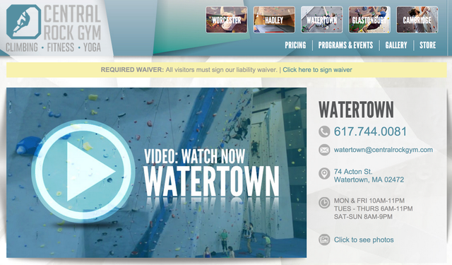
Address
Once users get to your website, it’s important that key information is easily accessible. You could argue that for climbing gyms, the most important information is your physical address, or addresses if you have multiple locations.
It’s shocking how many websites in the climbing industry do not display their address on the homepage or in another obvious location. Is it on the About Us page, the Contact Us page or perhaps hidden in tiny print in the footer? This information should be drop dead easy to find, and should not require more than one click from your homepage.
Furthermore, your address should not be embedded in an image that can’t be easily copied and pasted into a map tool. It may be helpful to embed a small map into your webpage that has your location clearly marked, and you should provide a handy map link so that smartphone users are just one tap away from driving directions.
Contact
Even though you’ve spent so much time putting every possible piece of information on your website, customers are still going to want to call or email with questions. Prominently placing your phone number and email or contact form is a fundamental tenet of customer service and adds legitimacy to your online presence.
Hours, Pricing and the Rest
Other key information such as facility hours, pricing, class schedules and waiver requirements should be easy to get to and the navigation terminology should be obvious for new visitors (e.g. “Join” sounds nice, but “Pricing” is more intuitive).
Tip: if your staff receives calls from customers that can’t find basic information on your website, like how to find your e-waiver, your website is failing its most essential function and should be redesigned.
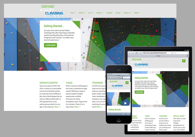
3. Mobile UnFriendly
A recent report shows that smartphones and tablets combined now account for 60% of all online traffic. As internet consumption quickly moves away from desktops to portable devices, ensuring your website is optimized for the smaller screens of tablets and smartphones is critically important.
Nevertheless, the majority of websites in the climbing industry are not mobile ready. This means mobile users are wasting time zooming and scrolling through tiny versions of your homepage and unable to access the pages they want through the minuscule navigation links.
To see how your website looks on screens of all sizes and platforms, head on over to quirktools.com/screenfly/ and enter your web address. The results may be shocking!
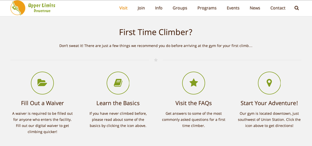
4. Leaving New Users in the Dark
While members are your bread and butter, new users are your most time consuming customer. Tailoring your website for first time visitors will save staff time and ensure that new users have appropriate expectations.
A number of climbing facilities direct new users to “Getting Started” or “Plan a Visit” pages on their website. The most successful sites have simple, clear guidance for new climbers that gently guide them toward introductory belay classes or introduce them to auto belays.
Don’t forget to include guidance for experienced climbers too. They will want to know if they need to schedule a belay or lead test ahead of time, if it costs money and what belay devices are allowed.
5. Annoying or Overwhelming
Websites can be beautiful and inspirational, but most importantly they need to be functional. This means they shouldn’t annoy the user. Interruptive elements like pop-ups about your waiver, flash animation and blinking images are the worst offenders. Large photos that aren’t optimized for fast loading can also make users crazy.
The biggest trap most websites fall into is drowning users in too much information. As mentioned above, the majority of your users are looking at your website from a small mobile screen, and won’t have the patience for scrolling through multiple paragraphs of text; even users with large desktop monitors want short chunks of information. The best websites keep their descriptions short and make smart use of sub-headings, bullet lists and graphic elements to deliver information in bite-size chunks.
6. The Wider World of Web
While your website is your primary presence on the web, many customers will check out your business through their favorite social website or app before deciding to make a visit.
Sure, you might be posting photos twice a day on Instagram and tweeting like crazy, but are your facility hours up to date on Google Maps, do you have good looking photos on Yelp, and are all of your services listed on Facebook?
Ensuring that all your essential facility information is correct, you’ve uploaded professional photos of your facility and you’ve responded to any questions or inaccurate comments on social media websites is essential to getting savvy web users to your facility.
Climbing Business Journal is an independent news outlet dedicated to covering the indoor climbing industry. Here you will find the latest coverage of climbing industry news, gym developments, industry best practices, risk management, climbing competitions, youth coaching and routesetting. Have an article idea? CBJ loves to hear from readers like you!